Monday, December 12, 2016

Remote Sensing of the Environment: Spectral Signature Analysis & Resource Monitoring

Remote Sensing Lab 8

Goals and Background

In remotely sensed images, each type of land surface and land cover reflects light specifically, and unique from other types of land surfaces and covers. The specific type of reflection is known as spectral reflectance or spectral signature. Studding these signatures allows us to differentiate between a conifer and deciduous forest, healthy and unhealthy vegetation, clean and contaminated water, for example, along with many other surfaces allowing us to study aspects of our earth.

The main goal of this lab is to provide experience in the measurement and interpretation of spectral signatures, and monitor the health of vegetation and soils.

Methods

Part 1: Spectral Signature Analysis

Using Erdas Imagine, the spectral reflectance of 12 materials and surfaces were collected in the Eau Claire and Chippewa County area. These materials and surfaces included:
  1. Standing Water
  2. Moving Water
  3. Forest
  4. Riparian Vegetation
  5. Crops
  6. Urban Grass
  7. Dry Soil (uncultivated)
  8. Moist Soil (uncultivated)
  9. Rock
  10. Asphalt Highway
  11. Airport Runway
  12. Concrete
I used the Drawing>Polygon tool to outline each surface, then used Raster>Supervised>Signature Editor to collect the spectral signature. Figure 1 displays the RGB values for all 12 surfaces, and Figure 2 shows the Mean Plot.

Part 2: Resource Monitoring

Using simple band ration functions in Erdas Imagine, I can monitor the health of vegetation and soils in the Eau Claire and Chippewa County area.

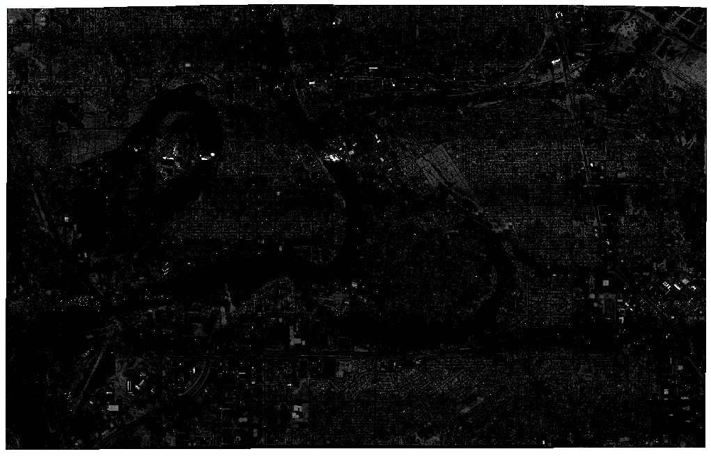
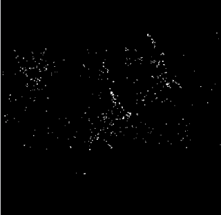
To measure the health of vegetation, I used the Normalized Difference Vegetation Index (NDVI). This is (NIR-Red)/(NIR+Red). The Raster>Unsupervised>NDVI tool allows me to perform this equation. The result is a grey scale image (Figure 3) where white represents the most highly vegetated areas and black represents the least vegetated areas. In ArcMap, the image can be symbolized in a visually appealing map (Figure 4).

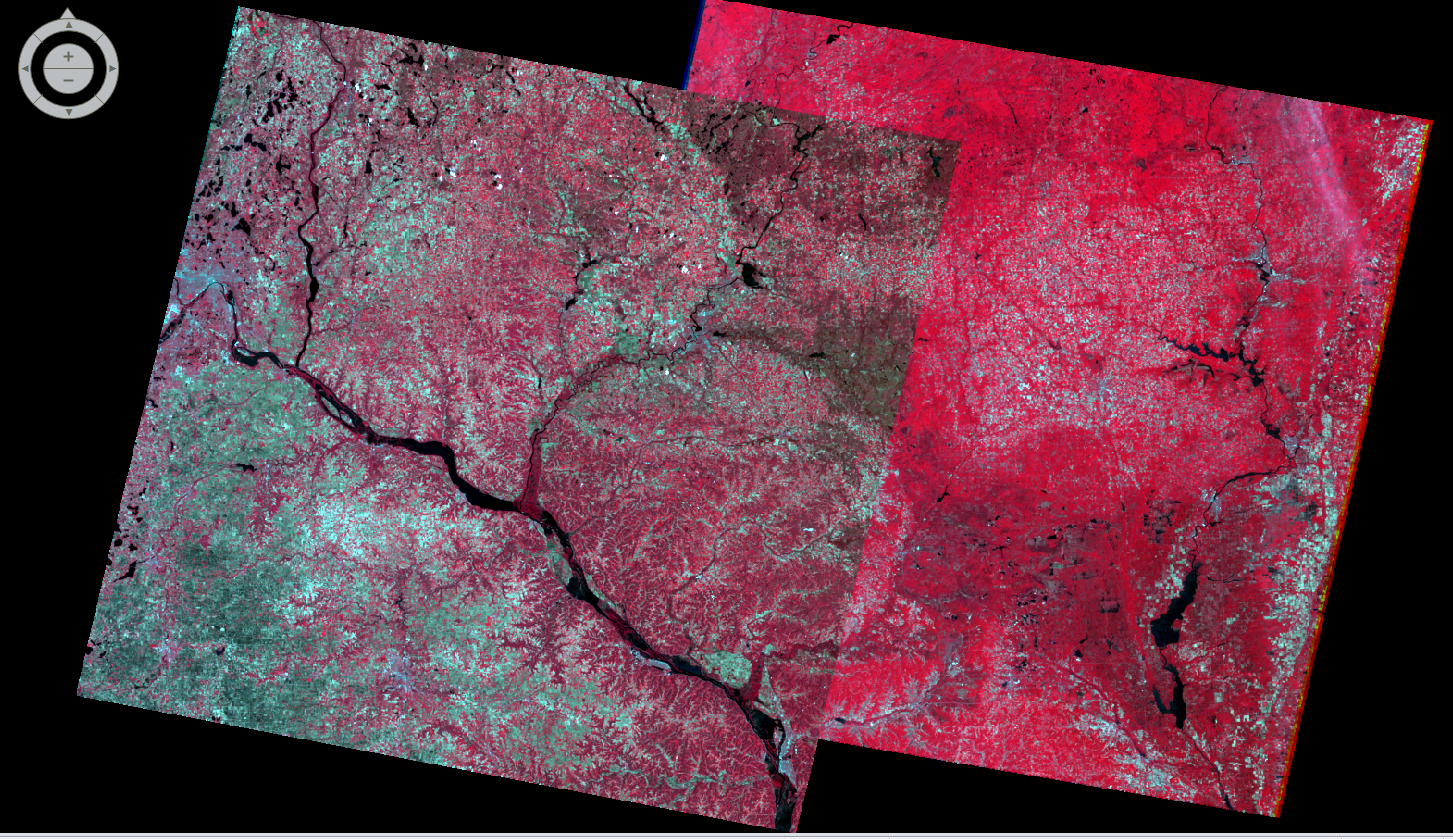
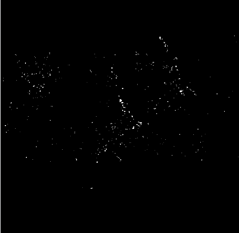
To study a component of soil health, I looked at the spatial distribution of iron contents in soils. A ferrous mineral equation can be used to detect this: (MIR)/(NIR). I used Raster>Unsupervised>Indices>Ferrous Minerals tool to generate an image using this equation. This image (Figure 5) is also grey scale, except white areas represent a high amount of ferrous minerals, and black represents areas where there is mostly vegetation and ferrousity of soils could not be detected. In Arc Map, this image can be symbolized in a visually appealing map (Figure 5).

Results

Part 1: Spectral Signature Analysis

Figure 1 shows the RBG values for each of the 12 materials. This data is visually represented in Figure 2. Due to the similarity of colors for some of the materials, colors have been modified in figure 2 so it is easier to tell which material applies to which spectral curve. Blue represents water, green represents different vegetation, yellows and browns represent man-made structures, and pink and purple represent dry and moist soil.

Figure 1

Figure 2

Part 2: Resource Monitoring

Figure 3 is the result of the NDVI function. Notice that the bodies of water and cropland are dark, while forested areas are white. Figure 4 is the same image symbolized in color. Figure 5 is the result of the Ferrous Minerals Equation. Dark represents high ferrous minerals and black represents covered soil where detection is impossible. Notice that the image is brighter in the southwestern half of the image. This is because most of the farmland and exposed soil is in this region. It should be noted that 'High Ferrous' is relative to the low ferrous and not exposed soil portions of the image. These areas may or may not be high ferrous relative to the national average. Figure 6 displays this data in color.

Figure 3


Figure 4


Figure 5


Figure 6


Sources

Kubishak, M. (2016, December 12)

Thursday, November 10, 2016

Remote Sensing of the Environment: LiDAR Remote Sensing

Remote Sensing Lab 5

Goals and Background

The goal of this lab was to practice using LiDAR data and become familiar with associated geoprocessing techniques in ArcMap. This includes the processing and retrieval of various surface and terrain models, and the processing and creation of an intensity image and other derivative products from the point cloud.

LiDAR, which stands for Light Detection and Ranging, is a rapidly expanding area of remote sensing where distance to a target is detected with a laser light. Between 200 to 400,000 pulses are emitted per second, and their echos are collected a receiving system that calculates precise X, Y, and Z coordinates for objects and surfaces on earth. 

To explore LiDAR data and common geoprocessing techniques, I used LiDAR data collected by Ayres Associates in 2013 for the county of Eau Claire. The data covers 567 square miles and was collected with a Riegl sensor mounted to a fixed-wing aircraft. Specific location of data collected using PLSS: (13-27-10SE, 24-27-10NE, 24-27-10SE, 25-27-10NE, 25-27-10SE, 15-27-09SW, 22-27-09NW, 22-27-09SW, 27-27-09NW, 27-27-09SW, 16-27-09SE, 16-27-09SW, 17-27-09SE, 17-27-09SW, 18-27-09SE, 18-27-09SW, 21-27-09NE, 21-27-09SE, 21-27-09NW, 21-27-09SW, 20-27-09NE, 20-27-09NE, 20-27-09NW, 20-27-09SW, 19-27-09NE, 19-27-09SE, 19-27-09NW, 19-27-09SW, 28-27-09NE, 28-27-09SE, 28-27-09NW, 28-27-09SW, 29-27-09NE, 29-27-09SE, 29-27-09NW, 29-27-09SW, 30-27-09NE, 30-27-09SE, 30-27-09NW, 30-27-09SW)

Methods

Create New LAS Dataset

In ArcMap catalog, I created a new LAS Dataset named Eau_Claire_City.lasd. The dataset is populated with the files provided by Ayres Associates. Using metadata provided by Ayres Associates I determined the horizontal and vertical coordinate system and defined those of the new dataset to match.

Use LAS Dataset Toolbar to experiment with Data Symbology

After turning on 3D Analysy and Spatial Analyst, I was able to use the LAS Dataset Toolbar to experiment with the symbology of Eau_Claire_City.lasd. Data can be configured to show aspect, slope, and contours of the area (Figure 1).

Using the LAS Dataset Profile View tool allows the user to draw a box around a particular area and view that object in a crossectional view rather than in map view (Figure 2).

Generation of LiDAR Derivative Products

Using the LAS Dataset to Raster tool, I created a Digital Surface model (DSM) using first return (Figure 3), Digital terrain model (DTM) (Figure 4), and a hillshade of the DSM (Figure 5) and DTM (Figure 6). 

Also using the LiDAR to Raster too, I created a LiDAR intensity image using Points and the Filter set as First Return (Figure 7). The image appears dark, so I also opened it in Erdas Imagine which automatically enhanced its display (Figure 8).

Results


Figure 1. Centering above UW Eau Claire and the third ward, Eau_Claire_City.lasd symbolized to show Aspect (top), Slope (middle), and Contour (bottom).

Figure 2. Map View of the Phoenix Park bridge crossing the Chippewa River.


Figure 3. Eau Claire Digital Surface Model

Figure 4. Eau Claire Digital Terrain Model

Figure 5. Hillshade of Digital Surface Model


Figure 6. Hillshade of Digital Terrain Model
Figure 7. LiDar Intensity Image in ArcMap
Figure 8. Enhanced LiDar Intensity Image in Erdas Imagine.


Sources


Tuesday, November 1, 2016

Remote Sensing of the Environment: Miscellaneous Image Functions

Remote Sensing Lab 4

Goals and Background

Lab 4 guides students thru a series of Miscellaneous Image Functions using Eradis Imagine 2016 to gain skills in:
  • Image processing
  • Enhancing images for visual interpretation
  • Delinage any study are (area of interest) from a larger satellite image
  • Mosiac multiple image scenes
  • Construct a simple graphical model for remote sensing analytics

Methods

Part 1: Image Subsetting

Clipping an remotely sensed image to a smaller area of interest (AOI) is important for image processing. Processing time increases with pixel volume, so by cutting to a smaller AOI you cut processing time. To achieve this, I used two methods:

  • Creation of rectangular box using the Inquire Box
  • Delineate an Area of Interest
    • Allows subsetting images that are not rectangular, like the shape of a county for example.

Part 2: Image Fusion

Images are fused together for a number of different reasons. In this excercize I conducted a Pan Sharpen Resolution Merge. I began with two images; a high resolution panchromatic (grey scale) image and a lower resolution multispectral (RGB, color) image of the same location. The image fusion combines the two images so that the resolution of the panchromatic image is maintained, but color is added to it. Nearest neighbor resampling was utlized.  

Part 3: Simple Radiometric Enhancement Techniques

Several radiometric enhancement techniques are used improve the spectral or radiometric quality of a raster image. For this lab we experimented with the Haze Reduction tool to remove clouds in an image.

Part 4: Linking Image Viewer to Google Earth

While Erdas Imagine, the analyzer can use the 'Connect to Google Earth' tool which pulls up a Google Earth browser. This browser can be displayed side-by-side with a raster image to be analyzed, linked, and synced with it so that the two viewers move over the same geography simultaneously. 

Part 5: Resampling

Resampling is altering the size of pixels of an image to increase pixel size (resample down) or reduce pixel size (resample up) depending on analytical demands. To practice this skill using an aerial photograph of Eau Claire, I resampled up, or reduced the pixel size from 30m to 15m. This was achieved using two different methods:
  • Nearest Neighbor
  • Bilinear Interpolation

Part 6: Image Mosaicking

Mosaicking is a necessary function for when an area of interest is larger than the available raster, or straddles the edges of two raster swats. The process blends the two images together so that they can be analyzed seamlessly. While there are multiple methods for doing this, we experimented with two of them:
  • Mosaic Express - select the upper and lower image and the function does the rest.
  • Mosaic Pro - this option takes longer, but provides a variety of options and flexibility so that the result of the mosaic can be as seamless as possible.

Part 7: Binary Change Detection

It is often valuable to analyze raster images of the same location taken from different points in time to analyze change over time. For this we estimated and mapped the brightness values of pixels that changed in Eau Claire and four neighboring counties between August 1991 and August 2011. This process required many steps.
  1. Create a Difference Image: Use functions > Two Input Operators tool to subtract the two rasters.
  2. Map Change Pixels in Output
    1. Use Spatial Modeler to compute this equation: Change in Pixel Values = Brightness values of 2011 image - Brightness values of 1991 image + constant (to avoid negative numbers)
    2. Analyze the histogram of this output to find the change/no change threshold
    3. Use Spatial Modeler to compute this equation: Either 1 IF (<input>change/no change threshold value) OR 0 OTHERWISE. This shows all pixels above the threshold and masks those below it.
  3. Use resulting raster to create a map in ArcMap displaying the change and no change areas in this section of Wisconsin over the last 20 years.  


Results

Part 1: Subsetting Outputs

Figure 1: Initial image eau_claire_2011
Figure 2: Image Outputs. Left, using Inquire Box Method to subset the cities of Eau Claire and Chippewa. Right, using Area of Interest Delineation to subset Eau Claire and Chippewa Counties. 

Part 2: Fusion Outputs

Figure 3 Image Inputs. Left, multispectral image with 30m resolution. Right, panchromatic image with 15m resolution.
Figure 4 Image Output. Left, original multispectral image with 30m resolution. Right, pansharpened fusion image with 15m resolution.


Part 3: Radiometric Enhancement Outputs

Figure 5: Left: Image input. Notice the white haze/cloud and black shadow.
Right: Image output. Notice that the white haze/cloud has disappeared, but the black shadow remains. Further image processing would be required to remedy this. 


Part 4: Linking Image Viewer

There were no outputs for this portion of the lab, however it was determined that Google Earth makes an excellent selective key when linked to the image viewer. 

Part 5: Resampling Outputs

Figure 6: Resampling with Nearest Neighbor. Original image on left, output on right. There are few changes in appearance; pixels are shifted up slightly.


Figure 7: Resampling with Bilinear Interpolation. Original image on left, output on right. Notice that the objects in the resampled image have smoother (less jagged) edges. 
Figure 8: Zoomed in Resampling with Bilinear Interpolation. Original image on left, output on right. Notice that the resampled image has pixels that are approximately 1/4 the size of the pixels in the original image, which makes sense given that 15m^2 is 1/4 the size of  30m^2.


Part 6: Image Mosaicking

Figure 9: Original images to be mosaicked.

Figure 10: Mosiac output using Mosiac Express. Notice sharp contrast line between the two images.
Figure 11: Mosiac output using Mosiac Pro. With histogram matching and overly, there is much smoother transition from one image to the next. 

Part 7: Binary Change Detection

Two Input Operators Method:
Figure 12: Left, Eau Claire 1991. Top right, Eau Claire 2011. Bottom right, output image.
Figure 13: Output Image Histogram. Lower Limit: -24, Upper Limit: 72


Spatial Modeler Method:

Figure 14: Model 1, used to find the difference between two input rasters. The two input rasters are Eau Claire 1991 and Eau Claire 2011, as depicted in Figure 12
Figure 14: Output of Model 1. Analyzed Histogram for mean and standard deviation to find the change/no change threshold value (202.186).
Figure 15: Model 2, used to generate a raster showing all pixels above the 202.186 and mask out those below the 202.186. Input raster is the Output of Model 1, depicted in Figure 14. Function: EITHER 1 IF ($n1_ec_91 > 202.186) OR 0 OTHERWISE. Ouput depicted in Figure 16.

Figure 16: Output of Model 2. White spots represents areas of change.


Image 16: Map representation of Output of Model 2, where red represents change and grey represents no change. 


Sources

No sources outside of those provided by instructor were used. These sources included Lab Directions and input images. 

Tuesday, May 17, 2016

GIS II Raster Modeling: Raster Analysis

Modeling Sand Mining Suitability and Sand Mining Impact in Trempealeau County, Wisconsin


Using spatial analyst tools and a specific set of criteria, southern Trempealeau County, Wisconsin was analyzed for suitable locations for future sand mines. The same area was analyzed for potential impact on the community and environment.

Data Sets and Data Sources

Sand Mining Suitability

Criteria Considered:

  • Geology - Jordan and Wonewoc
  • Land use and land cover
  • Distance to rail terminals
  • Slope
  • Water table
There are many factors considered when selecting an optimal location for a sand mine. The desirable geologic units, Jordan and Wonewoc must be located near the surface. Some land covers are better than others; for example a mine should probably not go in the middle of a city, a shrub land would be better. Distance driven to deliver sand to rail terminal should be minimal. Slope of land should be minimal. The water table should be close to the surface for accessibility in washing sand.

All of these criteria were considered when developing a suitability model. Figure 1: Suitability Model is a flow model of all steps taken. Further specification of reclassification and other tools is described in Table 1.
Figure 1: Suitability Model

Variable
Reclassification
Ranking
Explanation
Suitable Geology
Two Classes
Ej and Ew = 3
Everything else =0
The Jordan Formation (Ej) and Wonewoc Formation (Ew) are the only places to mine, so they received the highest value (3). The other formations received a 0 because there wouldn’t be a sand min where there isn’t sand to mine.
Suitable Land Cover
Four Classes
11, 12 (Water) = 0
23, 24 (Human Infested) = 0
90, 95 (Wetlands) = 0
21, 22 (Less Human Infested) = 1
81, 82 (Agriculture) = 2
41 – 43 ( Forrest) = 2
31 (Barren) = 3
51-52 (Shrub) = 3
71-74 (Herbaceous) = 3

It is impossible to mine in open water, so all water land covers were assigned zeros. More open tracts of urban land were assigned one. Areas relatively expensive to clear and beginning mining were assigned a 2. Land covers without much land to clear were assigned a 3 because they are the cheapest to clear.
Suitable Rail
Jenks Breaks, 3 Categories
Smallest Distance = 3
Medium Distance = 2
Longest Distance = 1

Suitable Slope
Jenks Breaks,
3 Categories
Smallest Slope = 3
Medium Slope = 2
Largest Slope = 1

Water Depth
Jenks Breaks,
3 Categories
Shallowest Depth  = 3
Medium Depth = 2
Greatest Depth = 1


Figure 2:  Table

The Trempealeau County Geology layer was projected appropriately and turned into a raster using the Polygon to Raster tool. It was then reclassified to select the desirable geologic units, the Jordan and Wonewoc.

NLCDD2011 is the National Land Cover Data set from 2011. This raster was reclassified to select and rank the most desirable land covers for sand mining, and exclude the least desirable, like urban cities (or human infested).

Terminals_WIMN is a point feature class of rail terminals in Wisconsin and Minnesota. Euclidean Distance was used to generate a distance raster. Distances were reclassified and ranked reflecting minimal distance as desirable. 

DEM is a digital elevation model for Trempealeau county. After it was projected appropriately (a projection measured meters), the slope tool was used to generate a raster describing slope. Block Statistics was used to aggregate data for simplified processing purposes. Slopes were reclassified and ranked to reflect low slope as desirable.  

tr_wtline0arc are water table contour lines from the Wisconsin Geological Survey. They were converted to raster format, and reclassified to reflect shallow depth as desirable.

Raster Calculator was used to multiply all five rasters together. Recall that all these rasters rank the most desirable characteristic highest, and therefore the highest outputs are the most suitable areas for placing a new sand mine.

This data was reclassified for simplicity, and is mapped in Figure 2: Suitability for Sand Mining. Red areas are least suitable for a sand mine, while green is the most suitable.  


Figure 2: Suitability for Sand Mining

Sand Mining Impact

Criteria Considered:

  • Proximity to streams
  • Prime farmland
  • Proximity to residential areas (noise and dust shed)
  • Proximity to schools (noise and dust shed)
  • Wildlife Areas
You'll recall from reading my GIS II Lab 1: Sand Mining Suitability Project that there are environmental and social impacts associated with sand mining. To minimize these impacts, we map where the impacts would be the greatest, and avoid them when selecting a location to mine. Proximity to major streams is considered to avoid pollution. Agriculture is one of the largest industries in Wisconsin, and definitely the heart of it. We'll want to leave prime farmland undisturbed. Proximity to residential areas and schools is considered to create a noise and dust shed and minimize noise and dust pollution in residential areas. Trempealeau County's Wildlife Areas will be preserved.

Figure 3: Impact Model depicts the flow of steps take to create an impact raster. Further specification of reclassification and other tools is described in Table 2. All reclassification was done so that areas with the greatest impact have the highest values. 
Figure 3: Impact Model
One of my favorite things about Wisconsin is its abundance of natural water features, however that abundance means that every location will be close to a river. Therefore proximity was only measured on perennial rivers. The Euclidean Distance tool was used, and the resulting raster was reclassified.

Prime_Farmland was converted to a raster and reclassified.

To measure proximity to residential areas, the residential areas themselves must first be defined.

Raster Calculator was used to multiply all five rasters together. Since areas with the highest risk was reclassified with the highest values, cells with the highest values would be most greatly impacted by a new mine. Figure 4: Impact of Sand Mining displays the resulting raster. Minimal social and environmental risk is symbolized in green and very high risk areas are symbolized with red.

Figure 4: Impact of Sand Mining

Suitability Overlay

A true suitability model will consider both desirable features, like geologic unit, and risk areas, like prime farm land. A flow model for this process is displayed in Figure 5: Overlay Flow Model.

Figure 5: Overlay Flow Model
The two models (Suitability of Sand Mining and Impact of Sand Mining) were reclassified into five classes, so that the most desirable locations for mining had high values. These rasters were multiplied using Raster Calculator, and reclassified again into five categories. The resulting raster is displayed in Figure 6: Overall Suitability for Sand Mining. The most suitable areas are symbolized in green, and the least suitable areas in red.


Figure 6: Overall Suitability for Sand Mining


Friday, March 18, 2016

GIS II Lab 2: Data Gathering

Data Downloading, Interoperability, and Working with Projections in Python

Sand Mining Suitability Project


Goals

Technical Goals
  • Familiarization with data downloading from a variety of internet sources
  • Prepare data and importing it to ArcGIS
  • Join data and building a geodatabase
  • Projecting data
  • Write a technical report about data sources and accuracy
Project Goals
To demonstrate the technical goals, I will be building a sutiability and risk model for sand mining in western Wisconsin with Trempealeau County and a few other western Wisconsin counties as the area of interest. For this portion of the multi-lab project I:
  • Downloaded and prepared relevant data
  • Wrote a technical report about the data sources and accuracy
  • Produced four maps
    • County Location
    • County Elevation
    • County Land Cover
    • County Agriculture Crop Type

General Methods

A variety of  base data was collected for this project from a variety of online sources. Data sets and their descriptions are listed in the table below.  For each set I went to the source website (hyperlinked in the source column), downloaded, unzipped, and saved each file. Additional data preparation is described in the Necessary Preparation column. After all files have been properly prepared, they were added to the Trempealeau County geodatabase

Base Data Set
Description
Source
Necessary Preparation
US Railway Network Shapefile
Shapefile of US railways
Clip data to Trempealeau County, change to Trempealeau County’s Projection
National Land Cover Raster and Digital Elevation Models (DEM) for Trempealeau County
Raster of US land cover types and DEMs for Trempealeau County and surrounding area
Used Mosaic to New Raster tool to combine the two DEMs.
*Raster
Wisconsin Crop Cover Raster
Raster describing the types of crop cover across Wisconsin
*Raster
Trempealeau County Land Records Geodatabase
Geodatabase containing a variety of datasets for Trempealeau County including Boundaries, Cadastral, Emergency, Land Use, Recreation, and Transportation shapefiles

US Web Soil Survey
Raster describing soil types across the United States
Imported tabular text files to geodatabase schema.
*Raster
*Check out my Python Scripts post Script 1 which describes how rasters were prepared to import to the geodatabase.

Data Accuracy

Base Data Set
Scale
Effective Resolution
Minimum Mapping Unit
Planimetric Coordinate Accuracy
Lineage
Temporal Accuracy
Attribute Accuracy
US Railway Network Shapefile
1:24,000 to 1:100,000
NA
NA
NA
Official Railway Guide, State DOTs, Rail companies, FRA’s Automated Geometry Locations
6/19/2015
NA
National Land Cover Raster
1:100,000
30m
5 pixels
25m
Multi Resolution Land Characteristics
04/09/2004 to 11/11/2011
Not yet conducted
DEMs for Trempealeau County
1:24,000
10m
NA
NA
US. Geological Survey
4/10/2015
NA
Wisconsin Crop Cover Raster
1:100,000
30m
5 pixels
25m
USDA/NRCS/NASS
2002 to 2016
All attributes: accuracy between 85% and 95%
US Web Soil Survey
1:12,000 to 1:63,360
NA
3 acres
0.01in
USDA Soil Conservation Service (1977)
National Resources Conservation
2004
All attributes tested against standard tables of valid soil attributes.